GRAPHICS 1
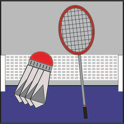
Olympic Symbol Technical Illustration
The objective of this project was to use geometrical shapes to create a symbol that depicts a certain olympic event. I chose badminton as my event since I enjoy playing and watching the sport. I used stencils for most of the shapes and a straight-edge tool for the racquet head. I liked the idea of the project, using only geometric shapes to put together my own icon for badminton, although if I messed up while putting ink onto paper, i had had to start all over.

Computer Olympic Symbol
In this project, we took the technical drawing of our olympic symbol and converted it into a digital graphic using Adobe Illustrator. The idea was to make the computer version as similar as possible to the drawing, though we added color and more of a background was possible. I enjoyed reciprocating the technical drawing into a graphic and bringing color to it, making it appeal to the eye.
Icon Set
The objective of this project was to create small icons representing things we like to do in our free time. Each icon of mine was made using shapes, lines of different stoke weights, and gradients. In this project I enjoyed challenging myself to create detailed graphics that depict activities I enjoy and getting better with using Illustrator. One thing I disliked was making sure that everything matched in terms of stroke weights which somewhat limited the detail for some graphics.

Logo
The objective of the logo project was to create our own corporation name and a graphic to serve as the logo for the company. I enjoy doing things outside, therefore I decided to make my company something to do with outside services. I really liked this project since you could create anything you want for the idea of the of the business as well as its logo which I had fun with. The main thing that was difficult was to make sure what I created was completely original.
Digital Portrait
The objective of this project was to have a picture taken of ourselves doing something interesting outside of school, which would then be brought into Adobe Photoshop. From there, we used a tool to convert to black and white and adjusted the darkness to where you could best see your face. I had fun going and getting the pictures and going through the steps to eventually screen print it on our own. There were a lot of steps in this process that needed to be well payed attention to in order to produce quality prints.

T-shirt Screen Print
The objective of this project was to do the same steps as the last project in terms of setting up the film and screen, though use a different workspace to fit printing a shirt. Screen printing on paper was more simple than printing on fabrics and shirts. I liked this project since we were allowed to put whatever we wanted on a t-shirt to give us experience with screen printing on fabrics. The only thing I disliked about it was that it was very hard to line up the shirt when laying it down to be printed. Often times shirts would end up with the image tilted.

Event Poster
|
The objective behind this project was, first, to design a poster for a certain event using graphics and different type styles. The class then learned how to operate the offset press with many rollers and moving parts. We printed out our plates which contained our poster image to use in the offset press, then printed 50 copies watching for quality as they fed out. I liked running the offset press and creating our own posters using it, I also learned a lot about the offset press and its affect in printing during the unit. I disliked the quality of the graphics on my poster, which I could have fixed before printing.
|
|

